Update Your Website
A lot of our clients ask us, “I spent a lot of money to build my website a few years ago. Why should I invest even more money to redesign it?”
Our typical answer is that things move very quickly in terms of technology and best practices with web design and development. It is important to update your website every few years to keep it relevant in your industry. The best example of this is that a decade ago, websites were only built for desktop monitors without a thought about what it would look like on a mobile device. At that time, cell phones barely had browser capabilities, and those were primitive at best.
Another example: 10-15 years ago, building a website in Flash, or using Flash slideshows used to be the height of web design technology. By the end of 2020, the major browsers (Chrome, Firefox, Safari) will stop supporting Flash altogether. Websites also have to be responsive in order to rank well with Google, whereas not too long ago, it wasn’t even a consideration.
It is crucial for businesses to refresh their website every few years to take advantage of new technologies, reassess if their website still reflects the main focus of their business, and to stay on top of changes in search engine optimization strategies.
Step into our “Wayback Machine” and take a look at how important updating your website can be for your business:
Through the Years
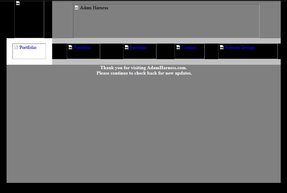
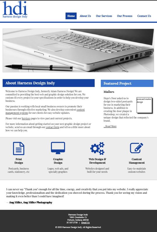
Adam's First Website
- Not mobile-friendly
- Coded in pure CSS/HTML
- All “special features” (gradient backgrounds, icons, hover effects) were images, not styles
- Alt-text was an afterthought instead of a key SEO tool
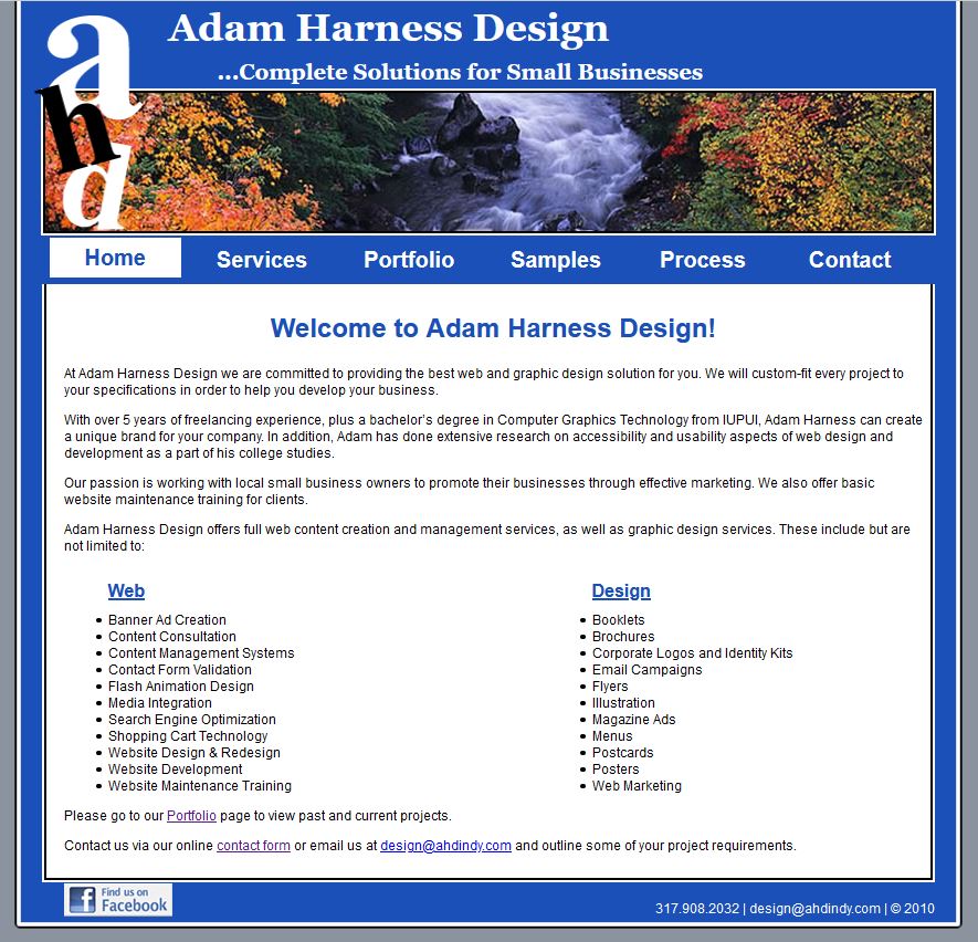
Implementing PHP
- Still not mobile-friendly
- Coded CSS/HTML and PHP
- Header image changed on each page using PHP
- Very rudimentary Portfolio page
- Boxy design
- Remember Facebook badges?
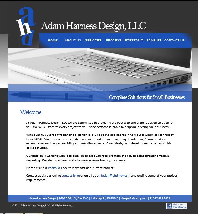
Moody Blues
- Also not mobile-friendly
- Got more creative with gradients and overlays in the header
- Dark theme and more corporate image-wise
- First use of JQuery on the Portfolio page (which no longer works)
- MANY examples of “exciting” JQuery features that we could include on our clients’ websites (these also no longer work).
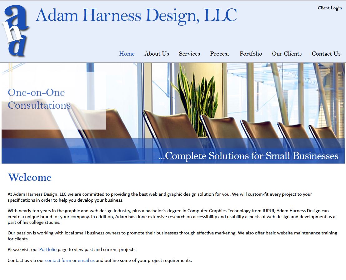
Lighter and Brighter
- STILL NOT MOBILE-FRIENDLY YET!
- Used a slider with text embedded in images in the header
- Portfolio was displayed using lightbox pop-up
- Several brightly-colored social media icons prominently displayed in the footer, including FOURSQUARE
A Responsive Website
- Finally mobile-friendly!
- Moved toward flat design elements (no gradients)
- Began using Fontawesome icons instead of creating images
- Implemented carousels to view projects in the portfolio
- Portfolio was database-driven
- First use of JQuery accordion for FAQ’s page
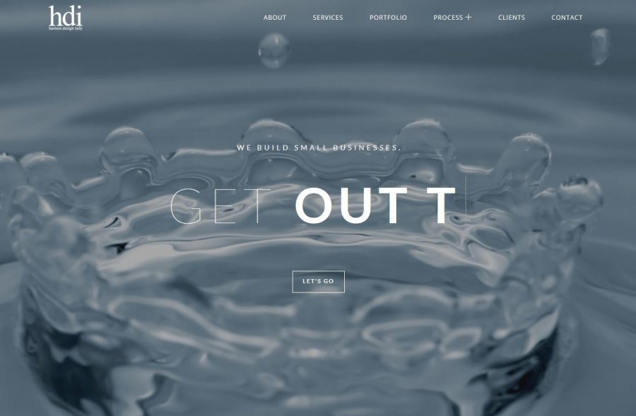
Monumental Change
- Fully responsive website
- Utilized parallax (moving background) design elements
- CSS/JQuery-driven text and image animations
- Single-page design
- Database-driven portfolio section (extremely hard to maintain)
- WordPress-like design, but still a static website
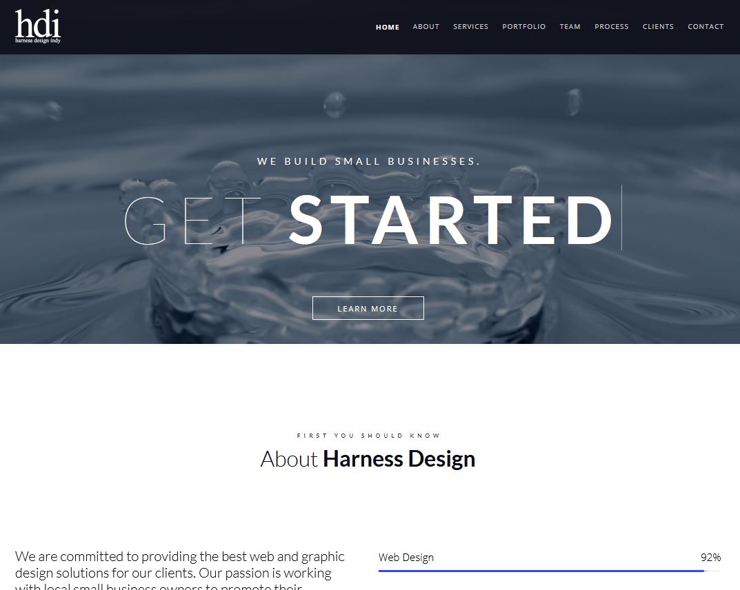
Current Design
- Responsive WordPress website
- Top SEO plugins and techniques in use
- Easy to update portfolio and pages to keep the website current
- Even more design elements to make pages engaging
- Multiple areas for users to interact with the website
- Use of CSS Flex to make responsive styling even easier